 Ask most people to name the architect of the Eiffel Tower, and more likely than not they will reply that it was Gustave Eiffel himself. However, whilst Eiffel and his team were behind the initial project and were the engineers that planned and built the tower, it was actually an architect called Stephen Sauvestre who gave the tower much of its distinct look.
Although Sauvestre’s name is rarely mentioned in connection with Paris’s iconic tower, it is one that can still be found on the walls of the city, particularly in the Plaine Monceau in the 17th arrondissement. This was where Sauvestre lived and worked, helping to build a whole new quarter of the city in eclectic styles that would influence the Art Nouveau movement.
Stephen Sauvestre was born in 1847, and was one of the first graduates of the Ecole spéciale d'architecture, a new school set up to separate this discipline from the world of the Beaux-Arts. Students learned about modern techniques involving metal structures, and a little later reinforced concrete, and were encouraged to work on useful municipal projects such as schools and hospitals.
A towering friendship with Gustave Eiffel
After working on a few small scale projects, Sauvestre's first important project in Paris was already a combined effort with Gustave Eiffel. The two men worked together on the design of the Pavillon de Gaz for the Exposition Universelle in Paris in 1878, a collaboration that would mirror their much more famous joint creation a decade later.
The tower project began in 1884, when two of Eiffel's employees, Maurice Koechlin and Emile Nouguier, proposed a project for a 300m high tower to mark the 1889 universal exhibition. The French authorities were looking for emblamatic and ambitious creations to help detract from national and international difficulties, but Gustave Eiffel knew that this creation would struggle without more of an aesthetic touch.
 The Eiffel Tower project team. Stephen Sauvestre is on the left, and Gustave Eiffel is in the centre.
Eiffel had already seen the project declared "un noire et gigantesque cheminée d’usine" and something that had stemmed from the "mercantiles imaginations d’un constructeur de machines" by a group of influential artists and architects, so he called once more on his architect friend Stephen Sauvestre to give the basic design a little more elegance. Sauvestre added a number of features to the design, introducing more curved forms as well as several additional 'attractive' buildings on the ground and on the first two floors of the tower, something that was perhaps instrumental in the Eiffel project being accepted.
A buider of houses
In 1860, an area known as the Plaine Monceau in the north-west of the city was annexed into Paris. This move to widen the scope of the city also included many other areas, including Belleville, Montmartre and La Villette, but whilst most of these sectors were already reasonably built up and populated, the Plaine Monceau was very largely rural.
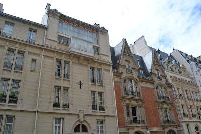
The house where Sauvestre lived, at number 16 Rue Eugène Flachat.
The development in this zone was incredibly rapid, driven by its proximity to a series of railway lines. The Baron Haussmann drew the principal axis of this development, stretching his standard large avenues across the district, but the land between them was virgin territory with freedom given to architects and developers to build on largely as they pleased.
The most important landowners - the Péreire brothers who had built the railways that cut through these fields - stipulated that only bourgeois houses could be built on their plots, and many of these survive today. One of the principal architects called on to design and build these houses was Stephen Sauvestre, and his signature is still visible on several of the facades.
No two creations the same
Sauvestre's creations can still be seen on the Avenue de Villiers, the Rue Ampère and the the Rue Eugène Flachat (where Sauvestre lived, interestingly in a house designed by another architect, Georges Bayard) amongst other streets in the area. He believed that no two of his houses should ever be the same, but what is interesting is that they are often not even remotely similar. Sauvestre played around with many styles, enjoying the freedom that this zone gave him. Whilst the Haussmannian boulevards alongside saw uniform erections in standard greys, on the smaller side streets houses were being built in a vast range of shapes, sizes and colours.
 Houses drawn by Stephen Sauvestre on the Plaine Monceau. Brick and stone are always clearly visible.
The houses were built for artists, bankers and businessmen, almost entirely between the period 1880-1890. This period of course corresponded with the construction of the Eiffel Tower, and whilst it may be difficult to spot any connections between the two, some links can be made. Sauvestre's education had made him a modernist, and he made sure that all of the houses he worked on had functional toilets, bathrooms and central heating. He was also keen to display the materials used in the construction of his houses on their facades, and this is something that can certainly also be said of the Eiffel Tower!
Note: Sauvestre's old school, the Ecole spéciale d'architecture, still exists, and held an exhibition of his heritage five years ago. An interesting article on the exhibition can still be found in the school's online archives: http://archive.sadesa.fr/charles-leon-stephen-sauvestre/


