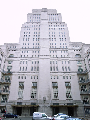
 Most of the posts on this blog have been about buildings I like, often little-known structures that I think deserve to be seen. It is my opinion that almost all buildings have qualities that can be appreciated, even if the overall result is unattractive or disappointing. It is rare indeed that I feel only antipathy when observing a building, but that is certainly the case with the edifice at number 21 Rue de Châteaudun, probably my least favourite building in the city.
For a building to be truly offensive, I think that it must play an everyday role in your life. Perhaps it is a poorly designed office building in which you work, or maybe a new construction built within view of your living space. Number 21 Rue de Châteaudun is a building that I often walk past, perhaps 2 or 3 times a week, and it always manages to catch my spirit and drag it down to the ground.
I am not even sure who I should be blaming for this. What I do know is that the building was originally designed by the architect Raymond Février in 1933 in an aggressive, triumphalist style. This is surprising when we consider that Février, with his brother Jules, had previously been responsible for one of Madrid's better known buildings, the classical French romanesque Edificio Metrópolis, erected in 1907.
 Jules died in 1937 aged 95, but I have no information about the age of Raymond when he designed the Parisian structure. Clearly he had changed his approach though, and was now more influenced by American modernist styles. Fortunately, this was not a style of architecture that caught on amongst his peers in the city, perhaps being interrupted then influenced by the Second World War. This design, finished just 6 years before war broke out, would become deeply unfashionable after the armistice, with its hints of totalitarian swagger.
Designed apparently for the 'La Paternelle' insurance company, it is the kind of building where you could imagine a Ministry of Truth being based. It has no visible entrance, no welcoming lobby and no obvious purpose. It is easy to imagine shadowy, faceless bureaucrats lined up at desks, passing their day erasing the unpersons. Indeed, it is somewhat reminiscent of the Senate House in London (1937), inspiration for George Orwell's 1984. It is on a smaller scale, but the whitewashed walls with phallic soaring columns and sunken, dark windows are clearly of the same era. These are imposing, threatening buildings, designed to make the outsider feel excluded and the insider more powerful.
 Février's is not the only name etched onto the building however, as the architects Jérôme Delaage and Fernand Tsaropoulos were to add their own 60 years later. Delaage and Tsaropoulos are responsible for most of the few high-rise blocks that have managed to make their way into the city, notably at the Square Vitruve and on the Front de Seine. Working on massive, imperial structures with little in the way of decoration, they would clearly have been pleased to be involved in the restructuration of the edifice on the Rue de Châteaudun. The building today still looks crisp and well-kept, but tellingly one of the few design features, a clock on the façade, no longer works. It is not clear how Delaage and Tsaropoulos altered the original structure, but they certainly felt that they had made sufficient changes to warrant adding their names to Février's.
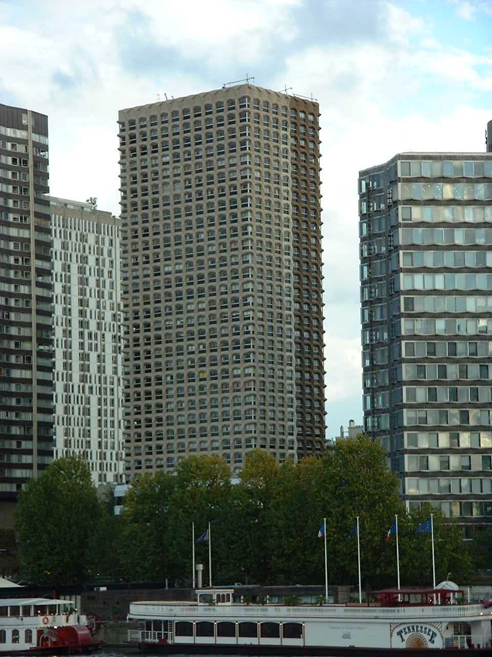
Interestingly, Delaage and Tsaropoulos were recently involved in another vanity case. The residents living in one of their constructions, the Tour Espace 2000 on the Front de Seine, had voted and then paid for a change of colour of the tower. When Delaage and Tsaropoulos saw the colour change however, which they described now as being 'caca d'oie' (Goose shit) rather than the original 'brun foncé..(comme)..un bloc vertical de mégalithe noir' (dark brown, like a black standing stone), they decided to take the residents' group to court. Last summer, the two architects won their case, pocketing 30,000 Euros and the right to force back the original colour of the building. The judge concluded that the darker colour, chosen deliberately to echo Stanley Kubrick's Space Odyssey, was an integral part of the creation and could not be changed without the permission of the 'creators'. It is not clear whether the estate of Kubrick was consulted, but it does seem that this team of architects considers their art to be more important than the everyday experience of those who live in or around their creations.
Note: The photo of the Tour Espace 2000 in the linked page was taken in 2005, so must be the changed colour as the repainting was done in 2003. This photo seems to show the colour transformation taking place.


14 comments:
How interesting that you attribute human characteristics to buildings. I guess I'm of a simpler mind-set. When I see a building (like 21 Rue de Châteaudun), I find it either pleasing or non-pleasing (and it is rare when a building even affects me as non-pleasing).
I also find it fascinating that a French court would find in favor of the "creators" as opposed to the "owners", unless of course, the creators are the owners. That's a strange precedent they've set. It could very well affect the sales of building for years. I would not even consider buying a building if I thought I had no control over the way I could present it. I'm rather certain I'm not the only one who feels that way.
surprsingly brutal for a building of that period..
En réalité je ne vois pas très bien ce que tu reproches à cet immeuble et pourquoi. Tu as sûrement une raison.
Je ne trouve guère de différence / celui de Madrid qui a une partie centrale en rotonde plus élevée c'est tout. Il y a des modes en architecture et cet immeuble correspond à l'époque mussolinienne sans doute.
Le pire est lorsqu'on en créé un type mussolinien hors de son époque, comme le belvédère Saint-Christophe par Boffil en 1985. Et pourtant lorsqu'on est dans cet immeuble de logement (celui de Cergy) c'est magnifique ; d'ailleurs Eric Rohmer y a tourné une partie de son film "l'ami de mon amie" avec de très beaux cadrages.
Tout dépend du point de vue où on se place, de son état d'esprit.
En ce qui concerne le mégalithe, je vois très bien, c'est une de mes références pour Cergy et son axe majeur dont j'ai mainte fois parlé sur Cergipontin ; et cela me fait penser au "bleu Klein" dont j'ai parlé aussi (pour l'opposer au bleu du ciel, lors de l'expo Klein à Beaubourg) et qui est breveté...
Cergie: Si je peux te repondre en Anglais...
I think anybody's feeling towards a building will be a personal one and something visceral. Let me say immediately that I don't find this building ugly. In fact, it is impressively designed and executed, but I simply find it to be offensive. It's a hulking elephant skeleton plonked down onto a corner, taunting us with its fortress like solidity. What annoys me the most of all though I guess is the fact that it has no apparent entrance. It takes valuable space in the centre of the city and does not even allow us to peek inside or feel that we could one day be a welcome visitor.
Really interesting - I'm not sure how I feel about that building, but I find the Tour Espace 2000 case amazing. Poor residents!
I see a pared down more muscular art deco influence, obviously to reflect the solidity and "trustworthiness" of an insurance company. The stepped back top levels helps in lightening its profile, but not enough to impart some proportionate grace. It would be interesting to tour the interior though!
[From your first photo, I do see an obvious entrance on the corner and two on the side, but not enough to see the detailing of the doors themselves!]
Yes, I didn't understand the reference to no entrance either because there clearly are at least three entrances visible in the first picture.
Gina and Starman: Looking at the picture from the angle it was taken from, you would think that those are entrances, but they are closed up today. Perhaps this is one of the differences between the first 1930s building and the renovated building in the 1990s. The only entrance I have noticed is an anoymous side entrance.
The wedge shape seems somewhat aggressive, as if it were a building in a Monty Python skit, about to go trundling down the street crushing those in its path.
Taste differs from one individual to another, but also your own taste changes with the years (at least mine). For example I used to like Bofill (to whom Cergie is referring); a lot less today when I feel the "coldness" of his buildings behind Montparnasse and at Cergy. I agree with you that the building you show is clearly today not what I consider as an attractive one, but it makes me indifferent; nothing to admire, nothing that makes it worse than many others. What I dislike the most are the buildings from the 60's or the 70's, just boxes without any effort of phantasy. But, who knows, maybe you need some decades , or centuries, to really see how architecture has survived (if it has survived)?
For the Défense building and its colours, I think I prefer it when it's half / half as on the picture you have linked to. :-)
Adam, not sure who architect is for new Lincoln Center building. But it is pretty amazing, which surprised me. Very inviting..
Hey Adam your architectural sense is appreciative. People like me who have less understanding about architecture would not be able to find any flaw in the building, but after viewing it from your perspective I could point out a couple of flaws in it.
The tower initially had another color, a darker one, reddish-brown-gray, like the monolith of Space Odyssey 2001. I lived there in the early 80´s, it seemed one version of the future had arrived :)
Buildeerz m'a vraiment impressionné par sa simplicité et son organisation. Trouver les bons professionnels a été rapide et facile. Buildeerz rend la planification de la construction beaucoup plus simple et fiable.
Post a Comment